Colour
Theory
Colour is
present when as object produces or reflects light and different colours are
produced by the different ways the light reflects off objects and how it is
interpreted by our brain once the light has entered through our eyes. In art
for example make-up colour is used to create visual experiences and sensations
for the viewer in order to show the designers thoughts and creativity. In
psychology colour is often seen to act as a stimuli as people react differently
and feel differently when they see different colours. However this concept is
also used in make-up as designers aim to create reactions to their work by the
audience who are viewing their creations.
Colour
theory is guidance on the mixing of colours and the effects that different
colours have in relation to each other. It also states the general opinions of
how people view different colour combinations and the visual effects they
create. The colour wheel was first developed by Isaac Newton in 1666 to show
the different colours and help to explain how they relate to one another. There
are a few factors that can be used to describe colours:
Lightness of
colour: How pale or dark a colour is.
Saturation:
How intense or dull a colour is.
Hue: The
name of the colour e.g. Red, blue, orange.
Primary
colours: In art the primary colours are red, blue and yellow. All the others
colours that we have can be made from these three colours. Red, blue and yellow
cannot be made by mixing any of the other colours.
Secondary
colours: These are green, orange and purple and are created by mixing two of
the primary colours together.
Tertiary
colours: These are created by mixing a primary and a secondary colour together.
They are red/purple, red/orange, blue/purple, blue/green, yellow/orange and yellow/green.
All of the
primary, secondary and tertiary colours are shown on the colour wheel.
The colours
on the colour wheel can be used together to create Colour Harmony. This is when
the combinations of the colours work well together because of their position on
the colour wheel in order to create colour schemes that are visually pleasing. The
colour scheme is the range of colours a designer chooses to use in their work.
Analogous
colours are any colour from the colour wheel and the two colours either side of
it.
Complimentary
colours are any colour and the colour directly opposite it on the colour wheel.
These two colours contrast from one another in a way that is visually pleasing.
Monochromatic
colours are all the shades of one chosen colour.
The Chromatic
colour is the colour that was actually chosen.
Cool colours
are usually blues and greens and warm colours are reds and oranges however all
colours can have cooler and warmer shades.
Neutrals
colours are shades of beiges, greys, browns and creams. They are shades that do
not appear on the colour wheel and they are sometimes described as having no
true colour however they are normally tones that have undertones of the colour
wheel colours in them.
Achromatic
colours are black, white and grey. Black and white are tones and this is why
they do not appear on the colour wheel. They are usually described as having no
colour because black absorbs all light and light needs to reflect off an object
in order for it to have colour. Also white reflects all light and some light
needs to be absorbed by an object in order for it to have colour. Therefore
grey is often described as a colour as it reflects some but not all light
however it is created by mixing black and white and not colours.
Analogous
Contouring: Kryolan
Supracolor-
White
070, Blue 10 and Lila, Illamasqua
Translucent Powder.
Eyes: Kryolan
Supracolor
Lila,
White 070, Illamasqua
Translucent Powder, Maybelline Great Lash Mascara- Blackest Black, Kryolan
Viva Eyeshadow-
Lavender and Sage Blossom
Lips- Kryolan
Supracolor-
Lila,
Mua
Matte Shine- Persian Plum
Achromatic
Contouring: Kryolan
Supracolor-White
070,
Mac Paintstick
Pure White, Illamasqua
Translucent Powder, Kryolan Viva
Eyeshadow- Caraway and White Pepper
Eyes: Kryolan
Viva eyeshadow-
Caraway and White Pepper, Barry M Liquid
Eyeliner- Black, Rimmel Scandaleyes
001 Black, Maybelline Great Lash Mascara- Blackest Black.
Lips: Kryolan
Supracolor-
071
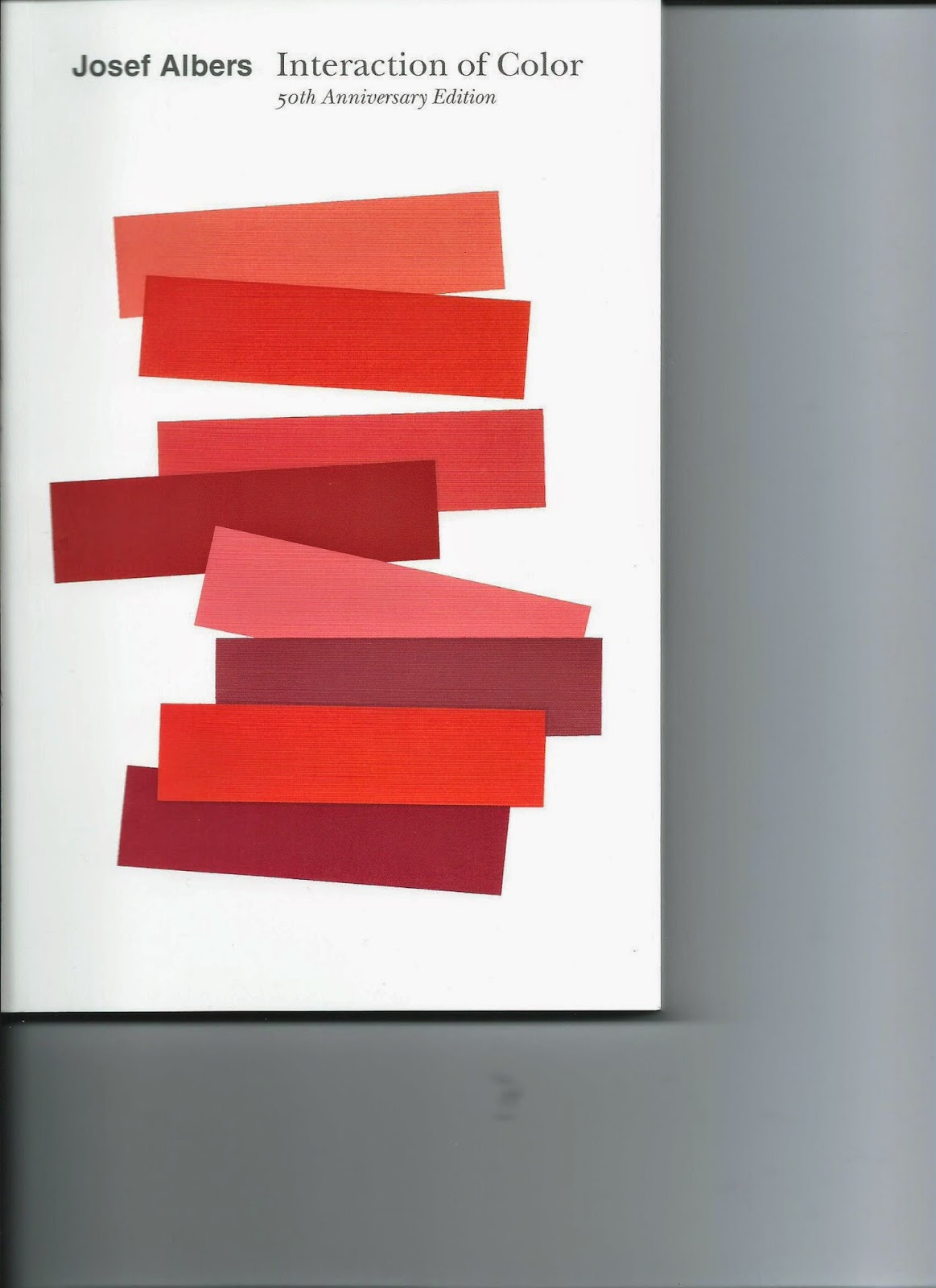
I bought this book as colour theory is something that interests me as I love using lots of different colours in my work. As this book was originally published 50 years ago I was unsure whether the ideas in it would still be relevant today. Obviously colours havn't changed but I wondered whether the way we perceive different colours and their interaction with each other had. I have not yet read the full book but after reading certain parts its obvious that Albers ideals and way of thinking are still as relevant today as they were when the book was first published. At first I found it difficult to adapt to the writing style and some parts I had to read twice to fully understand the type of language that was used, however when you understand what is being said it makes you reconsider how colour has a big impact on how we see things and different colours effect each other in so many different ways. I would recommend the book to anyone who wants to learn more about colours and the way we see them or to anyone who just loves colour.
 |
| The book I bought. |


No comments:
Post a Comment